HUMAN-COMPUTER INTERACTION RESEARCH

Streamlining academic course management for college students.
This project explores Canvas, the web-based learning management system used by the University of San Francisco. Originally completed as a semester-long group project for my Human-Computer Interaction course in Fall 2023, it focused on understanding student attitudes toward the platform through extensive user research and user-centered design thinking.
Our team identified key areas for improvement and proposed a redesign of the application, which we presented at the conclusion of the course. This case study includes the presentation slides we created as a team.
In 2025, I revisited this project independently, applying new skills gained through an internship and the Google UX Certificate to create an updated and more refined final design.
YEAR
2023
2025
ROLE
CO-RESEARCHER
CO-UX DESIGNER
DURATION
4 MO. (AUG-DEC 2023)
2 DAYS (MAR 2025)
Original Redesign Proposal
During the redesign phase, our group distributed features among team members. I focused primarily on developing solutions for Discoverability Features and user Preferences.
01
Taskboard
Establish consistency across Web/Mobile platforms
New Notifications tab on Dashboard. (Customizable Notifications for assignment completion reminders.)
Reduces Gulf of Execution; provides consistency across platforms for users while managing their assignments.
Notifications tab provides User Control and Freedom
02
Inbox
Minimize navigation bar clutter
Gmail-like interface for cross-application consistency reducing user adaptation efforts.
Improved user usability by adding buttons for composing, replying, and forwarding emails, alongside a quick navigation tab
Target Gulf of Execution and Evaluation
03
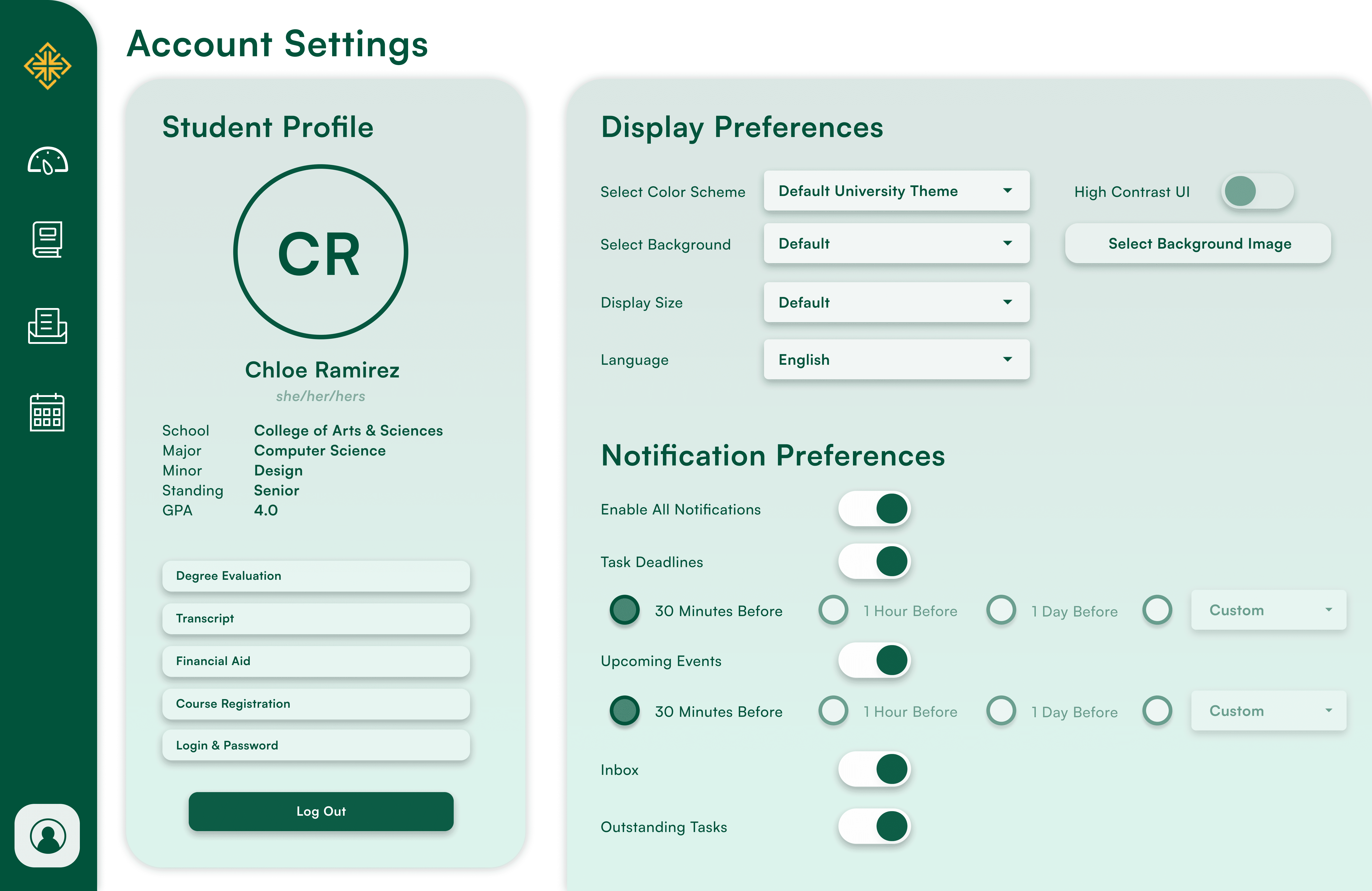
User Preferences
Offers more personalized experiences with the UI
Expands user customization.
Establishes a sense of authority for users (User Control and Freedom)
04
Discoverability Features
Tool-tips will appear when the cursor hovers over different items within the application
Tooltips for links, buttons, and features aligns with Norman’s Visibility principle,
Descriptors reduce user confusion and frustration.
Prototype


Final Redesign
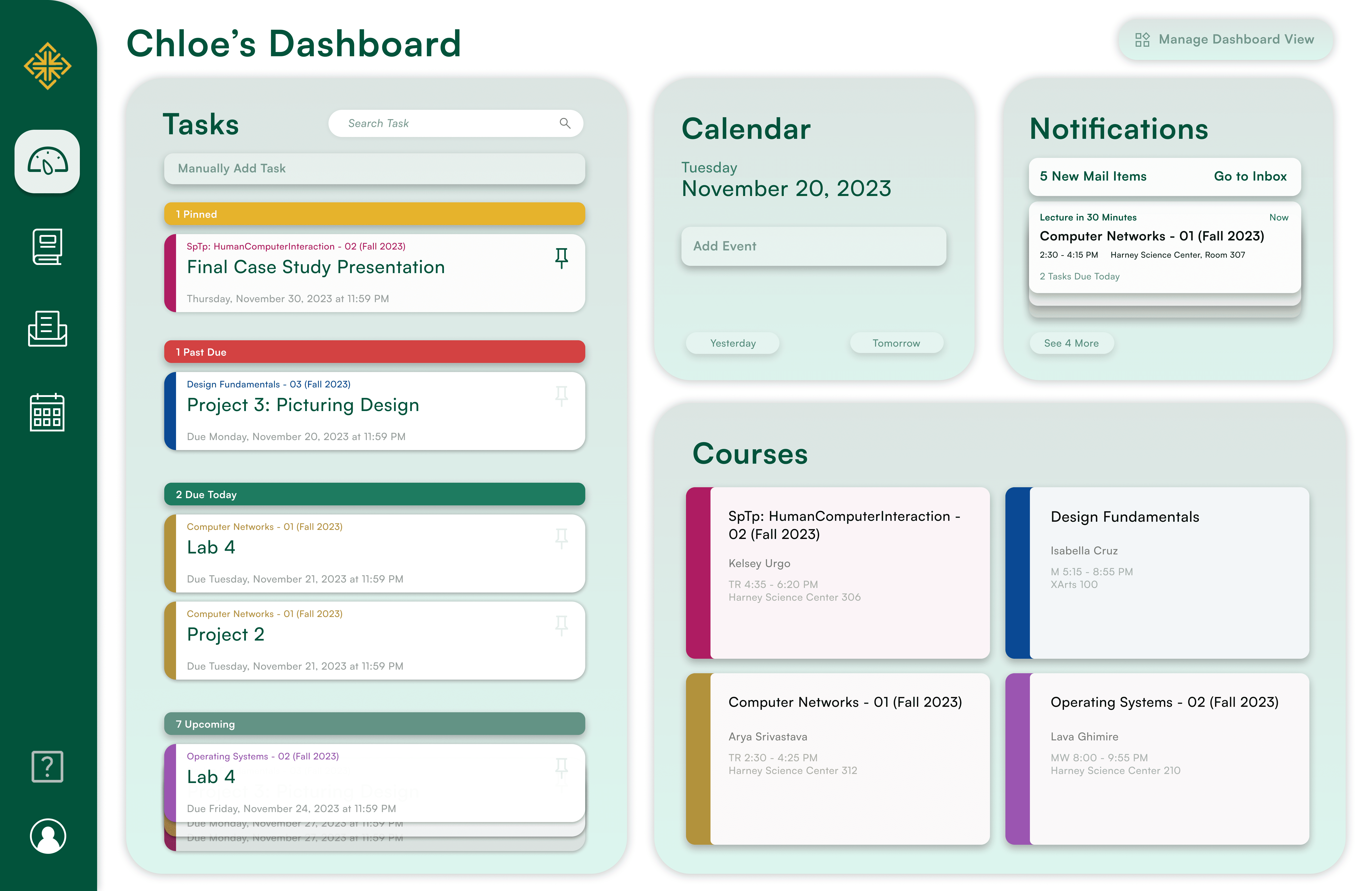
In March 2025, I returned to this project to assess the original design and explore opportunities for improvement. This updated version was created over the course of two days.
01
Dashboard
I consolidated commonly used features into a single, customizable dashboard, including the task board introduced in the original redesign. This new dashboard is designed to be intuitive, efficient, and user-driven, giving individuals greater control while streamlining overall system flow. By reducing the time and effort required to access key features, the redesign minimizes confusion and decreases reliance on external support. That said, a clearly visible help button remains available in the updated navigation bar for users who still need guidance.
02
Simplified Inbox
Drawing inspiration from the Gmail inbox, I reorganized the layout of the inbox to reduce visual clutter and improve ease of use.
03
Visual Design Enhancements
To improve clarity, consistency, and visual appeal, I refined the interface with cleaner typography and more intentional use of spacing and hierarchy. These changes aimed to create a more modern and cohesive look while improving readability and reducing cognitive load.