MOBILE USER EXPERIENCE DESIGN
MOBILE USER EXPERIENCE DESIGN
Dining Menu App
Dining Menu App
Thoughtfully integrating technology into digitally minimalist spaces.
This project explores how intentional design can elevate real-world experiences without disrupting or overwhelming them. The challenge was to create an intuitive digital menu app that complements the hospitality and comfort of dining out. Crafted through an iterative process of thoughtful research and inclusive design, my solution prioritizes accessibility, empowerment, and ease for every user without compromising the rhythm of sit-down dining experiences.
YEAR
2025
ROLE
PRODUCT DESIGNER
DURATION
3 WEEKS
DELIVERABLES
USER PERSONAS
USER JOURNEYS
STORYBOARDS
WIREFRAMES
PROTOTYPES
DESIGN SYSTEM
FINAL DESIGN
01
Introduction
This project was completed in part with the Google UX Design Certification course, where students are tasked with applying the full UX Design process to a self-directed project. Early on, students select a randomly generated design prompt to guide their work. Mine was: "Design an app for a sushi restaurant menu."
Considering my love for food, cooking, and dining, this prompt felt close to my heart (and my stomach). On top of that, I felt that it offered broad space for investigation and interpretation. As someone who's always curious about how digital tools can enhance real-world experiences, I wanted to explore technology in spaces that emphasize ambiance, presence, and connection.
This case study walks through the process I followed to turn the loose prompt into a digital menu experience for a sushi restaurant.
02
WHY AM I DESIGNING THIS PRODUCT?
Background
My design process starts with an exploration the setting that the product will live in. Before narrowing my focus onto menu apps, I researched the restaurant dining scene to understand the elements that contribute to good dining experience. Ultimately, this established a strong foundation to build the rest of the project off of.
HOW DO RESTAURANTS CREATE GOOD CUSTOMER EXPERIENCES?
The Dining Experience
Restaurants need to provide great experiences to build rapport with patrons and increase customer satisfaction. From the moment customers enter the door to their parting words with the host, every detail can contribute creating memorable dining experiences.
Crucial elements outside of the meal itself can include the efficiency and hospitality of the service, the ambiance of the environment, and the cohesiveness of a style and theme.


Photo by Falco Negenman on Unsplash
WHAT IS THE ROLE A TRADITIONAL MENU PLAYS IN THE DINING SCENE?
The Menu
A great dining experience starts with the menu. Acting as a silent salesperson, the menu is the first critical element that restaurant-goers are introduced to during their experience. The details of a menu can influence customers impressions of a restaurant along with the choices they make while ordering.
HOW DO DIGITAL MENUS FIT INTO THIS?
Digital Menus
Digital menus rose in popularity during the COVID-19 pandemic, while businesses prioritized contactless interactions to continue running. As safety restrictions lifted, digital menus remained for the convenience and business opportunities it offered to restaurants and their patrons.
Now, businesses could easily rearrange or update menu items. efficiently monitor sales, and streamline service, especially with table-side or online ordering features.

https://www.butterballfoodservice.com/resources/to-qr-code-or-not-to-qr-code/
03
WHO AM I DESIGNING FOR?
Empathizing with Users
After establishing the dining scene, I began researching user attitudes toward digital menus to gain a stronger understanding of how the technology has been impacting dining experiences. I looked through forums and discussions on Reddit along with reviews on the App Store to gather the user research.
HOW DO USERS FEEL ABOUT MENU APPS?
Affinity Diagram
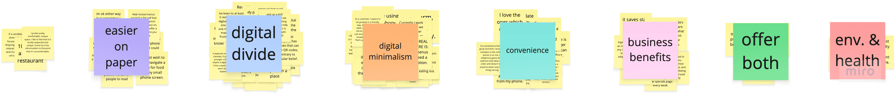
SYNTHESIZED FINDINGS
User Research Insights
FRUSTRATION
Digital Fatigue
With a strong desire to savor presence and moments of connection, a majority of restaurant-goers don't want phones out at the table.
FRUSTRATION
Unequal Access to Technology
Introducing digital menus reliant on mobile devices assumes that all customers have access to reliable, modern digital devices and carry a certain level of digital literacy, consequently excluding countless patrons from the dining experience.
FRUSTRATION
It's Easier on Paper
Several users find browsing easier with traditional paper menus. Small screens, complex navigation, and confusing interfaces have left users feeling averse towards digital menus.
HOW WERE MY ASSUMPTIONS CHALLENGED?
Foundational Research Reflection
Prior to conducting research, I failed to consider that several users might feel resistant against digital products. Realizing that I needed to cater to an overwhelming majority who simply didn't want to use the product presented a new challenge as I moved forward towards a solution. As someone who is comfortable with technology and owns a mobile device, I hadn't thought about this population. This insight was a valuable reminder to consider my own biases as I continued on with the project.
EQUITY-FOCUSED DESIGN
Additional Design Considerations
01
Multilingual Acess
02
Dietary Restrictions
03
Accessible Design
WHAT ARE THE MAIN ITEMS THAT MY USERS NEED ADDRESSED?
User Needs
01
Simple & Intuitive Interface
02
Choices & Customization
03
Accessible Design
04
Digital Minimalism
05
Subtlety Enhancement
INFORMING USER-CENTERED DESIGN
User Personas
The following personas were developed to support my design process and ensure that my users' needs remained at the core of the process.
PERSONA A
Rosario

AGE
78
LOCATION
NORTHERN CALIFORNIA
FAMILY
WIDOWED,
HAS CHILDREN & GRANDCHILDREN
OCCUPATION
RETIRED
TECH COMFORT
LOW
"I don't need my grandchildren to help me do something as simple as ordering food."
GOALS
Make confident choices and order her food without relying on any of her family.
Maintain her values and enjoy a quality, distraction-free meal with her grandchildren.
Easily navigate and read menu offerings.
FRUSTRATIONS
Unfamiliar with smartphones and other modern tech.
Misses the personal touch of traditional dining service.
Feels embarrassed relying on others to order.
BACKGROUND
Rosario is a grandmother of five teens. Following years of lockdowns and social distancing, she now cherishes monthly dinners out with her grandchildren. But as restaurants increasingly replace traditional analog menus with digital ones, she finds herself out of step. She believes that good service should come from real people and feels that phones at the table disrupt the joy of shared meals. When it comes to ordering, she feels overwhelmed by cluttered interfaces on small screens and embarrassed to ask for help. Being strong-willed and independent, she'll sometimes choose a dish she doesn't want, just to avoid the hassle. The experiences are beginning to leave her feeling disempowered and disconnected.
PERSONA B
Amelia

AGE
27
LOCATION
TACOMA, WASHINGTON
FAMILY
IMMEDIATE FAMILY ABROAD
OCCUPATION
HEALTHCARE ASSISTANT
TECH COMFORT
MODERATE
"I just want to eat and relax."
GOALS
Smoothly order food with clarity, convenience, and ease.
Avoid language barriers.
Find options that meet her dietary needs.
FRUSTRATIONS
Works a long shift, just wants to order her food, but digital menus are finicky, confusing, and difficult to navigate.
Doesn't know whether or not digital menu items align with her dietary restrictions.
English is not her primary language, and she can't understand some parts of the menu.
BACKGROUND
Amelia just finished another 12-hour shift. Starving and too exhausted to cook at home, she opts to dine-in at a restaurant. She sits at her table for a few minutes before realizing that she needs to scan a QR code on the table to see the menu. Already feeling drained, she opens a confusing menu system and tries to navigate for something gluten-free. The menu doesn't offer transparency on ingredients, and as a non-native English speaker, she wishes there were pictures or translations for some of the menu items. She wants to ask for help, but there's no staff in sight. At this point, she's tired, hangry, and wishing she chose somewhere else to eat.
PERSONA A
Rosario
AGE
78
LOCATION
NORTHERN CALIFORNIA
FAMILY
WIDOWED,
HAS CHILDREN & GRANDCHILDREN
OCCUPATION
RETIRED
TECH COMFORT
LOW
"I don't need my grandchildren to help me do something as simple as ordering food."
GOALS
Make confident choices and order her food without relying on any of her family.
Maintain her values and enjoy a quality, distraction-free meal with her grandchildren.
Easily navigate and read menu offerings.
FRUSTRATIONS
Unfamiliar with smartphones and other modern tech.
Misses the personal touch of traditional dining service.
Feels embarrassed relying on others to order.
BACKGROUND
Rosario is a grandmother of five teens. Following years of lockdowns and social distancing, she now cherishes monthly dinners out with her grandchildren. But as restaurants increasingly replace traditional analog menus with digital ones, she finds herself out of step. She believes that good service should come from real people and feels that phones at the table disrupt the joy of shared meals. When it comes to ordering, she feels overwhelmed by cluttered interfaces on small screens and embarrassed to ask for help. Being strong-willed and independent, she'll sometimes choose a dish she doesn't want, just to avoid the hassle. The experiences are beginning to leave her feeling disempowered and disconnected.
PERSONA B
Amelia
AGE
27
LOCATION
TACOMA, WASHINGTON
FAMILY
IMMEDIATE FAMILY ABROAD
OCCUPATION
HEALTHCARE ASSISTANT
TECH COMFORT
MODERATE
"I just want to eat and relax."
GOALS
Smoothly order food with clarity, convenience, and ease.
Avoid language barriers.
Find options that meet her dietary needs.
FRUSTRATIONS
Works a long shift, just wants to order her food, but digital menus are finicky, confusing, and difficult to navigate.
Doesn't know whether or not digital menu items align with her dietary restrictions.
English is not her primary language, and she can't understand some parts of the menu.
BACKGROUND
Amelia just finished another 12-hour shift. Starving and too exhausted to cook at home, she opts to dine-in at a restaurant. She sits at her table for a few minutes before realizing that she needs to scan a QR code on the table to see the menu. Already feeling drained, she opens a confusing menu system and tries to navigate for something gluten-free. The menu doesn't offer transparency on ingredients, and as a non-native English speaker, she wishes there were pictures or translations for some of the menu items. She wants to ask for help, but there's no staff in sight. At this point, she's tired, hangry, and wishing she chose somewhere else to eat.
04
WHAT CAN I CONSIDER DURING THE DESIGN PROCESS?
Design Research
After establishing the dining scene, I began researching user attitudes toward digital menus to gain a stronger understanding of how the technology has been impacting dining experiences.
HOW HAVE OTHERS APPROACHED A DIGITAL MENU SOLUTION?
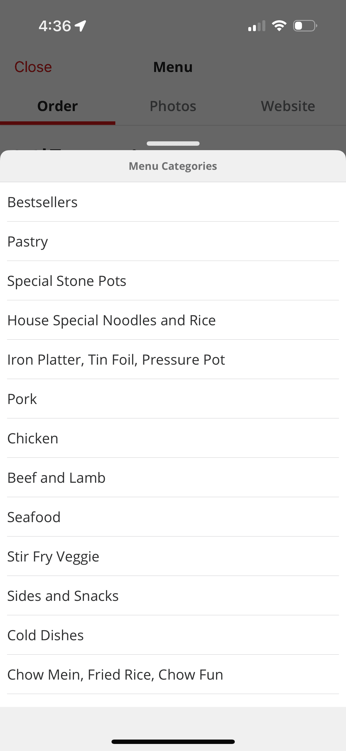
Competitive Analysis
WHAT WORKS WELL
Table-side Ordering
I explored different menu apps and went to a few restaurants that use menu apps. Several of them included table-side ordering features so that guests could order at their convenience.
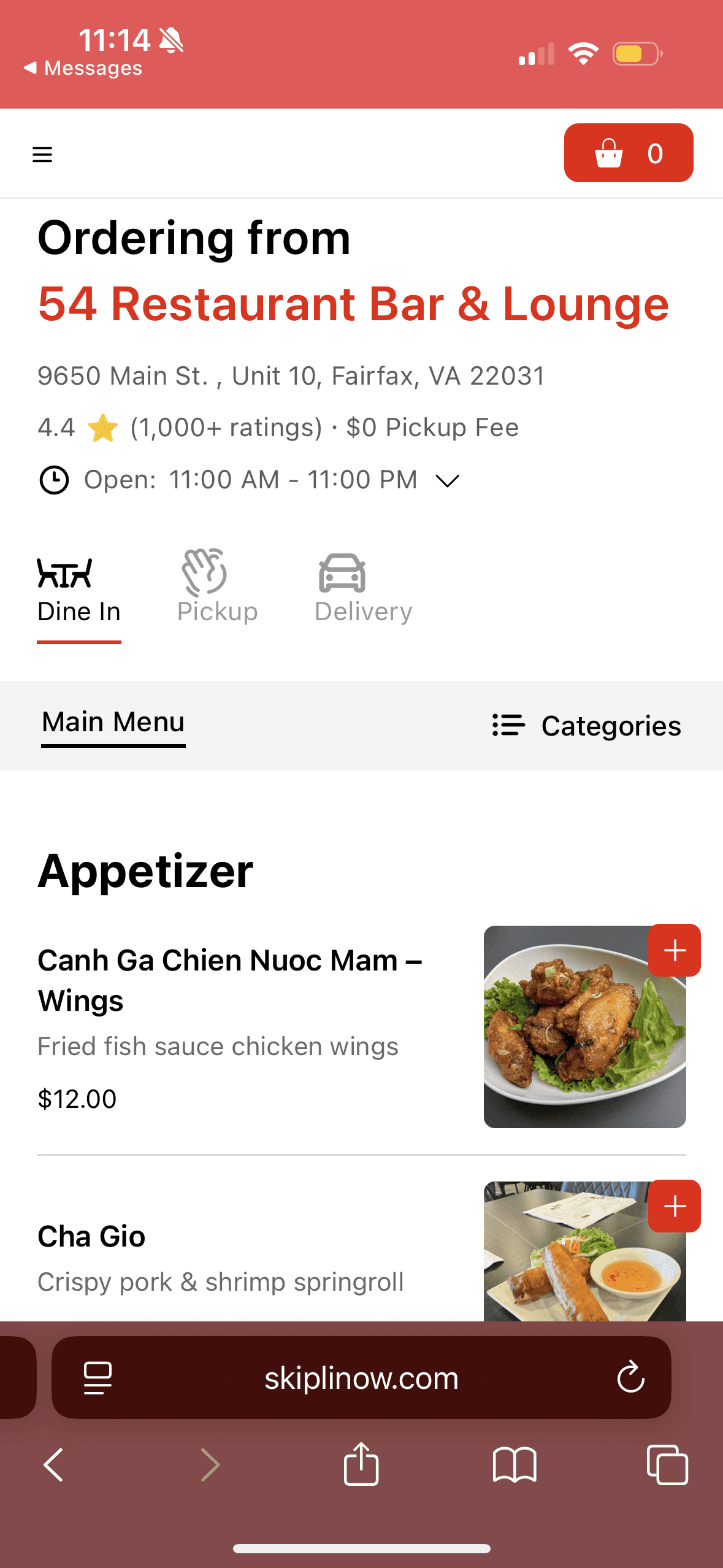

WHAT WORKS WELL
Menu Categorization
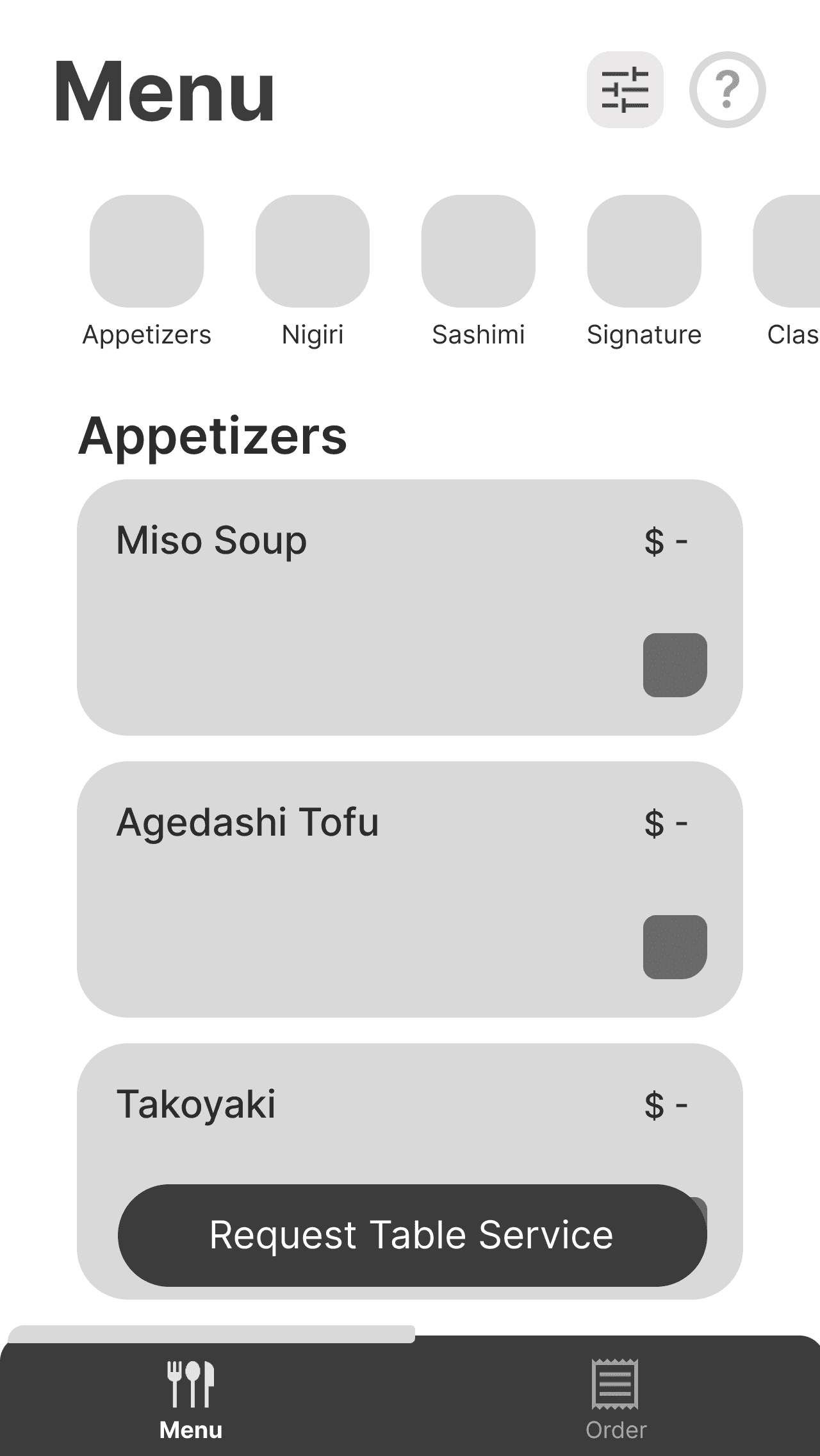
Many mobile apps rely on item categorization to make the most of limited screen space and support easier browsing.
WHAT WORKS WELL
Use of Imagery
Mobile apps offer an advantage over analog menus by incorporating rich imagery, creating a more immersive and engaging experience for users.
OPPORTUNITY
Including Human Service
Most menu apps operate as standalone tools, with limited connection to real human service. I saw this as a missed opportunity to create a good dining experience and made it a priority to design a solution that brought digital convenience and in-person interactions together.

OPPORTUNITY
Limit Status Updates
At one restaurant, their menu app displayed real-time status updates on our table's orders. Though insightful, I noticed that it encouraged frequent phone checking. I wanted to avoid features like this that could distract from the dining experience.

WHAT WORKS WELL
Table-side Ordering
I explored different menu apps and went to a few restaurants that use menu apps. Several of them included table-side ordering features so that guests could order at their convenience.
WHAT WORKS WELL
Menu Categorization
Many mobile apps rely on item categorization to make the most of limited screen space and support easier browsing.
WHAT WORKS WELL
Use of Imagery
Mobile apps offer an advantage over analog menus by incorporating rich imagery, creating a more immersive and engaging experience for users.
OPPORTUNITY
Including Human Service
Most menu apps operate as standalone tools, with limited connection to real human service. I saw this as a missed opportunity to create a good dining experience and made it a priority to design a solution that brought digital convenience and in-person interactions together.
OPPORTUNITY
Limit Status Updates
At one restaurant, their menu app displayed real-time status updates on our table's orders. Though insightful, I noticed that it encouraged frequent phone checking. I wanted to avoid features like this that could distract from the dining experience.
WHAT WORKS WELL
Table-side Ordering
I explored different menu apps and went to a few restaurants that use menu apps. Several of them included table-side ordering features so that guests could order at their convenience.
WHAT WORKS WELL
Menu Categorization
Many mobile apps rely on item categorization to make the most of limited screen space and support easier browsing.
WHAT WORKS WELL
Use of Imagery
Mobile apps offer an advantage over analog menus by incorporating rich imagery, creating a more immersive and engaging experience for users.
OPPORTUNITY
Including Human Service
Most menu apps operate as standalone tools, with limited connection to real human service. I saw this as a missed opportunity to create a good dining experience and made it a priority to design a solution that brought digital convenience and in-person interactions together.
OPPORTUNITY
Limit Status Updates
At one restaurant, their menu app displayed real-time status updates on our table's orders. Though insightful, I noticed that it encouraged frequent phone checking. I wanted to avoid features like this that could distract from the dining experience.
HOW HAVE OTHERS CREATED NON-TRADITIONAL DINING SERVICE?
Unique Dining Experiences
VISUAL MENU DISPLAYS
Sampuru
Sampuru refers to the hyper-realistic food replicas displayed outside of many Japanese restaurants, enticing guests to enjoy a meal. This practice of showcasing food stood out and inspired me to design a digital experience that similarly creates an appeal for the food.

CONVEYER BELT SUSHI
Kaitenzushi
Kaitenzushi, or conveyer belt sushi, involves plates of sushi traveling around the restaurant on a moving belt, allowing customers to grab whatever they want, whenever they want. I aimed to reflect the efficiency of this practice and how it places control directly into the hands of the guest.
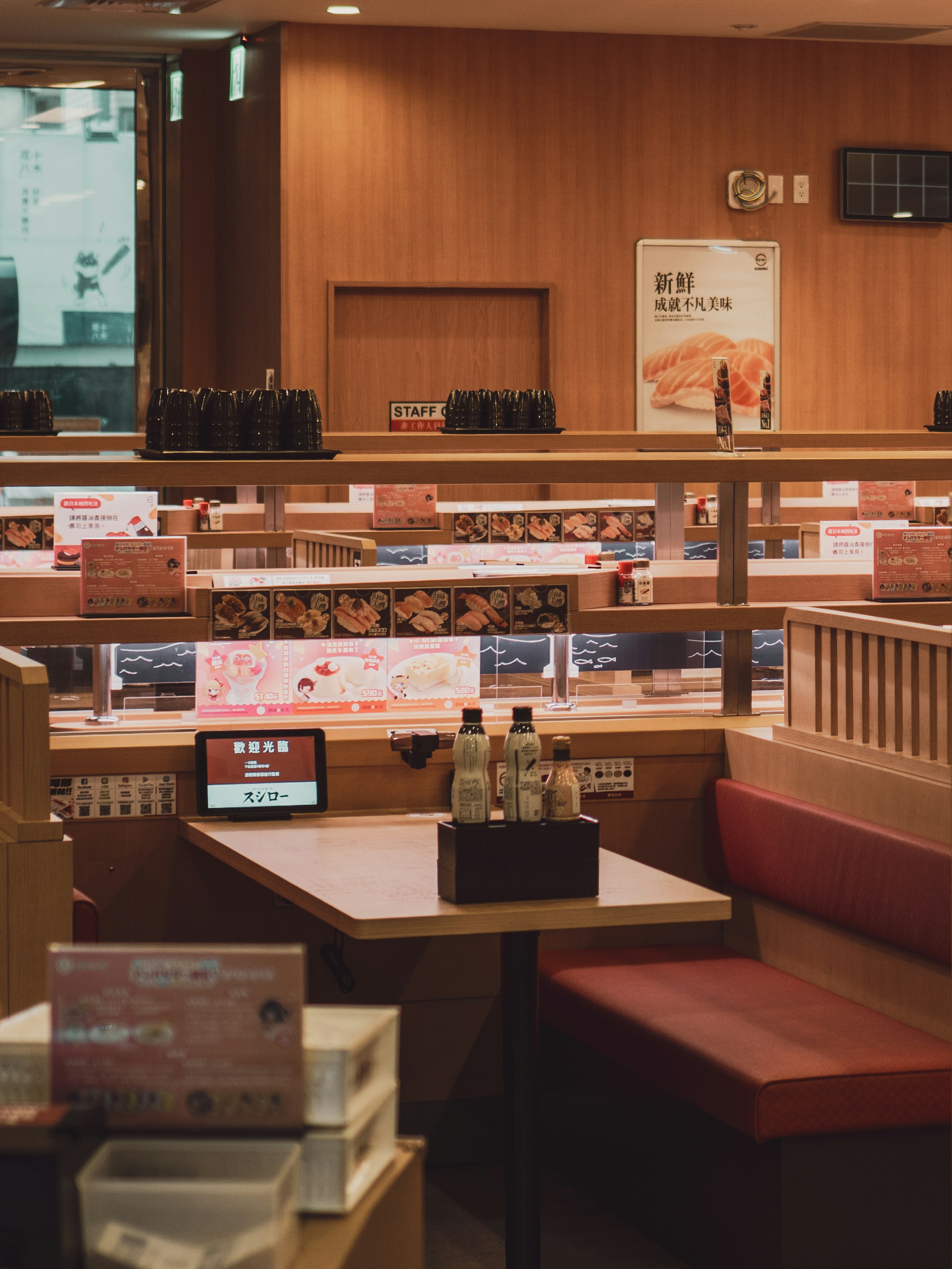
Photo by Raymond Yeung on Unsplash
DIGITAL CUSTOMER SERVICE
Robot Restaurants
Service robots have become a growing presence in Japan, taking, delivering, and even preparing orders at cafes and restaurants. The robo-waiters have become increasingly popular in sushi restaurants, and I considered the intrigue and fascination it brought to guests while exploring how to integrate technology into a dining experience.
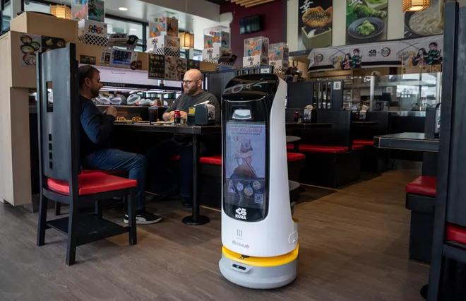
https://www.freep.com/picture-gallery/entertainment/dining/2023/05/09/robot-food-service-workers-metro-detroit/11768942002/
VISUAL MENU DISPLAYS
Sampuru
Sampuru refers to the hyper-realistic food replicas displayed outside of many Japanese restaurants, enticing guests to enjoy a meal. This practice of showcasing food stood out and inspired me to design a digital experience that similarly creates an appeal for the food.
CONVEYER BELT SUSHI
Kaitenzushi
Kaitenzushi, or conveyer belt sushi, involves plates of sushi traveling around the restaurant on a moving belt, allowing customers to grab whatever they want, whenever they want. I aimed to reflect the efficiency of this practice and how it places control directly into the hands of the guest.
Photo by Raymond Yeung on Unsplash
DIGITAL CUSTOMER SERVICE
Robot Restaurants
Service robots have become a growing presence in Japan, taking, delivering, and even preparing orders at cafes and restaurants. The robo-waiters have become increasingly popular in sushi restaurants, and I considered the intrigue and fascination it brought to guests while exploring how to integrate technology into a dining experience.
https://www.freep.com/picture-gallery/entertainment/dining/2023/05/09/robot-food-service-workers-metro-detroit/11768942002/
05
HOW MIGHT WE APPROACH A SOLUTION?
Early Ideation
Brainstorming Solutions
Leaning on the insights I synthesized from the user research, I began my ideation process by asking How Might We questions, jotting down messy notes, and sketching out different ideas.
I work best when I have all of my thoughts spread out on paper, so my workspace is often filled with post-it notes and paper scraps. Although the process does get messy at some point, it's helpful sorting through my notes to come to valuable or feasible solutions.
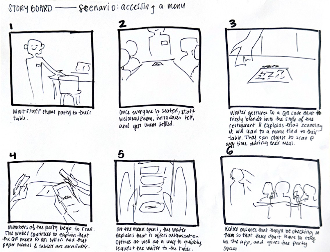
Storyboarding the Concept: The App
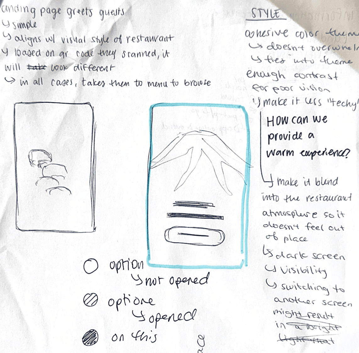
I designed this solution as a Progressive Web App (PWA) — a website that behaves like a native app and can be used offline, eliminating the friction of downloading an app or relying on a stable network connection to view the menu.
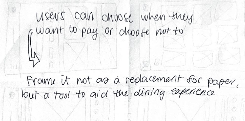
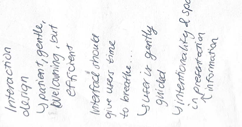
I envisioned the user experience starting with the host introducing the digital menu as a complimentary enhancement to the dining experience. By reframing it in this way, it empowers users with choice and maintains human service in the dining experience.
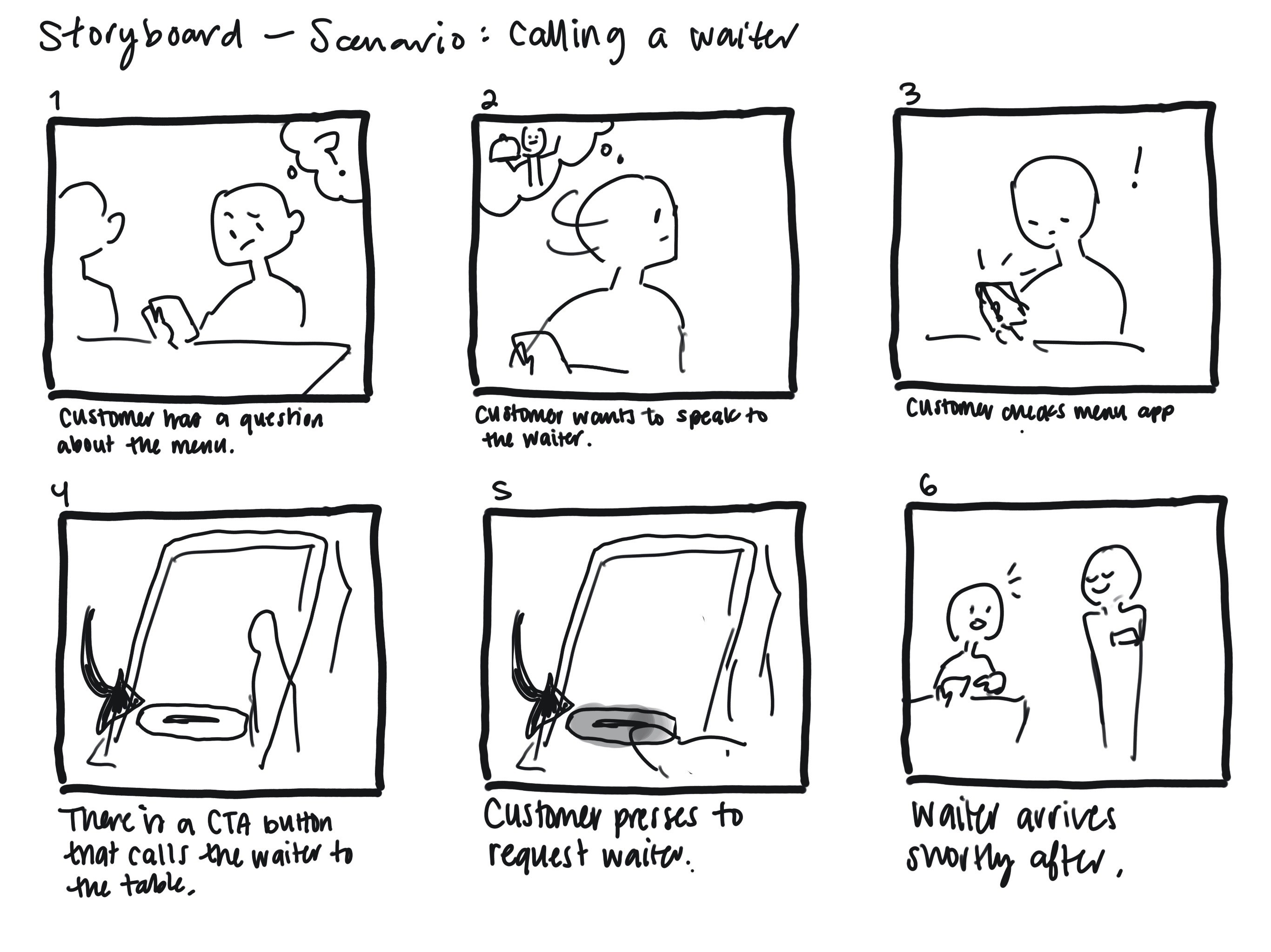
Storyboarding the Concept: Service Request Feature
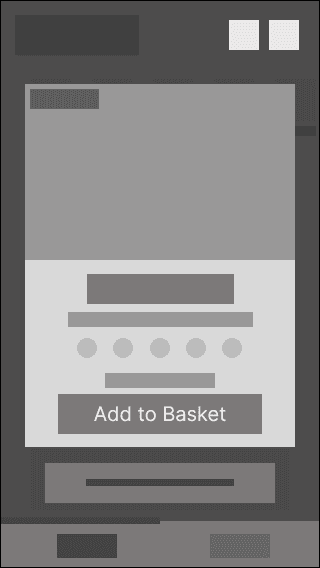
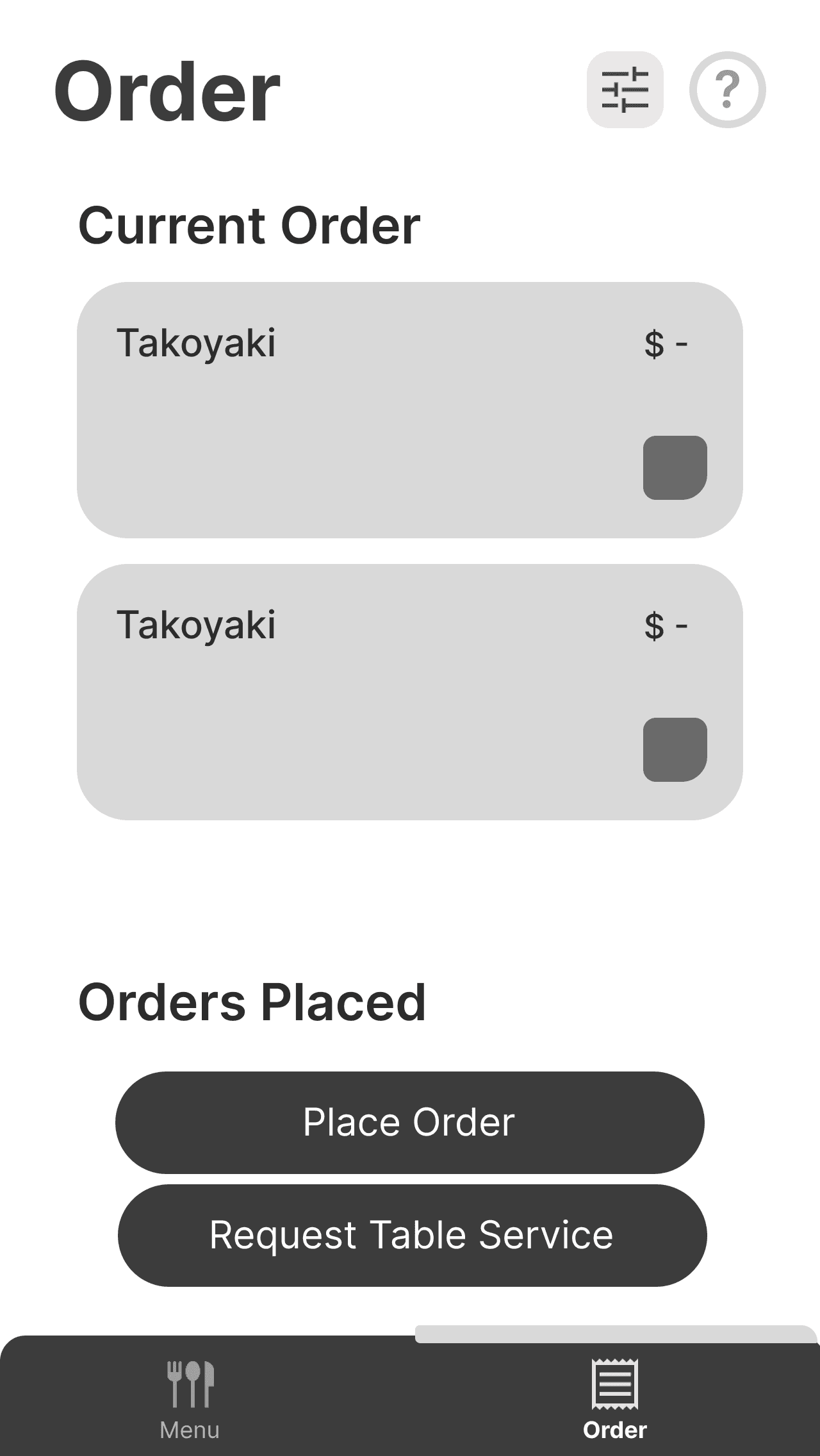
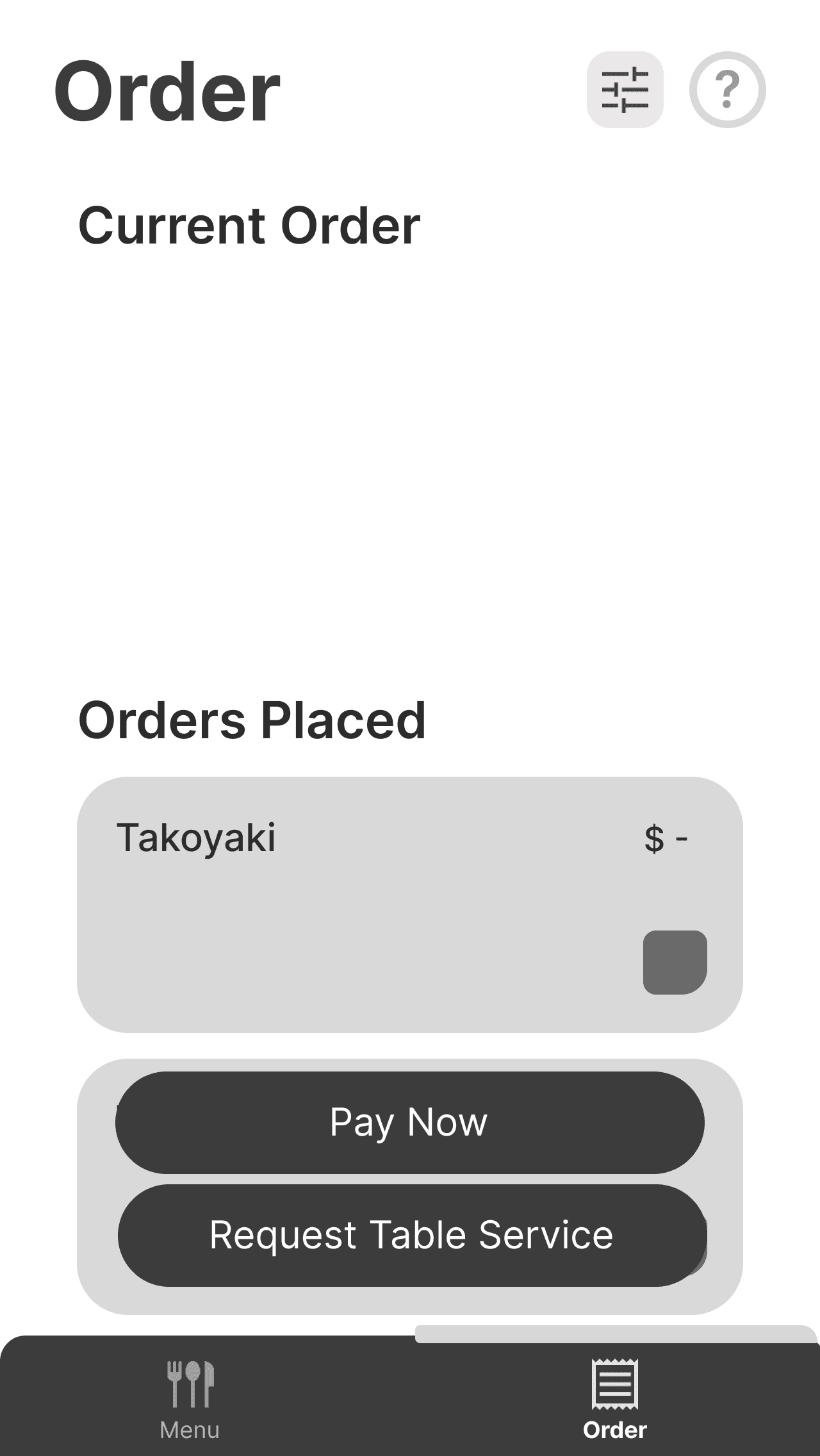
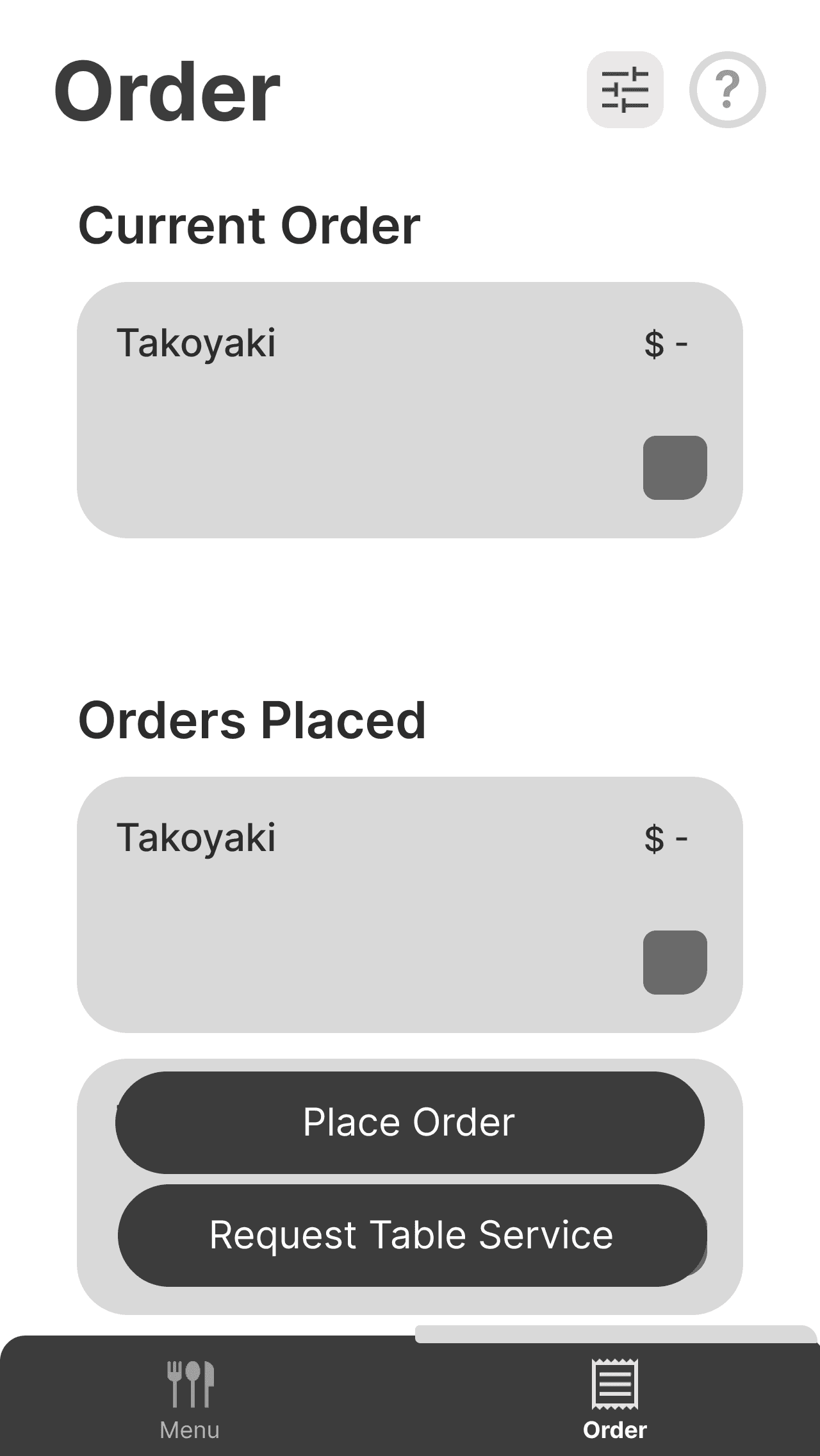
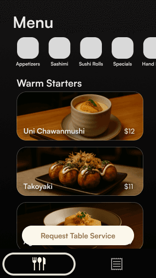
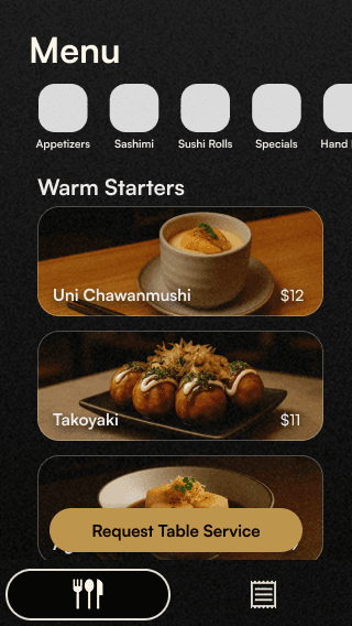
The goal was for users to feel supported by the menu app — if they chose to use it — without placing the burden of the entire interaction on them. I prioritized a feature that would allow guests to call a staff member to their table at any time. This would reinforce the idea that the app was there to enhance the experience, not replace it.
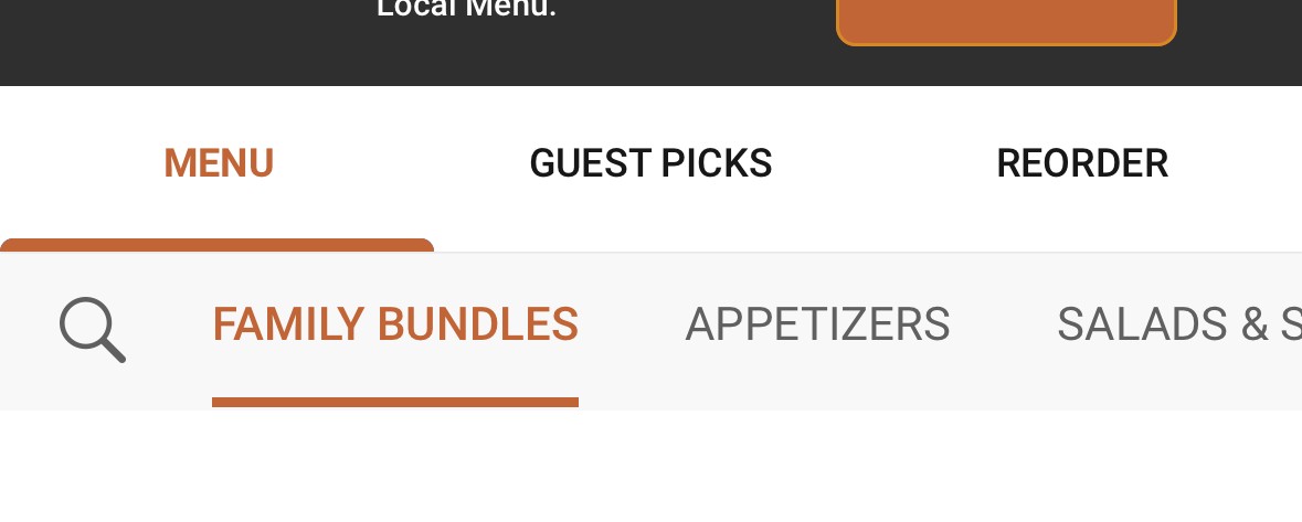
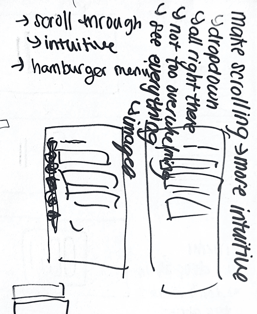
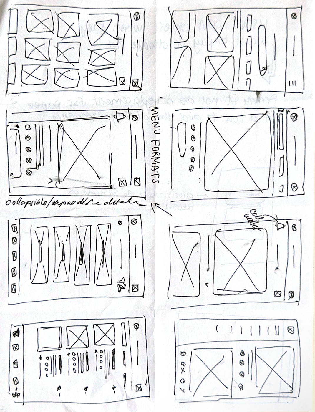
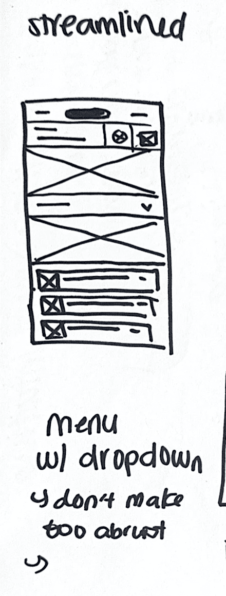
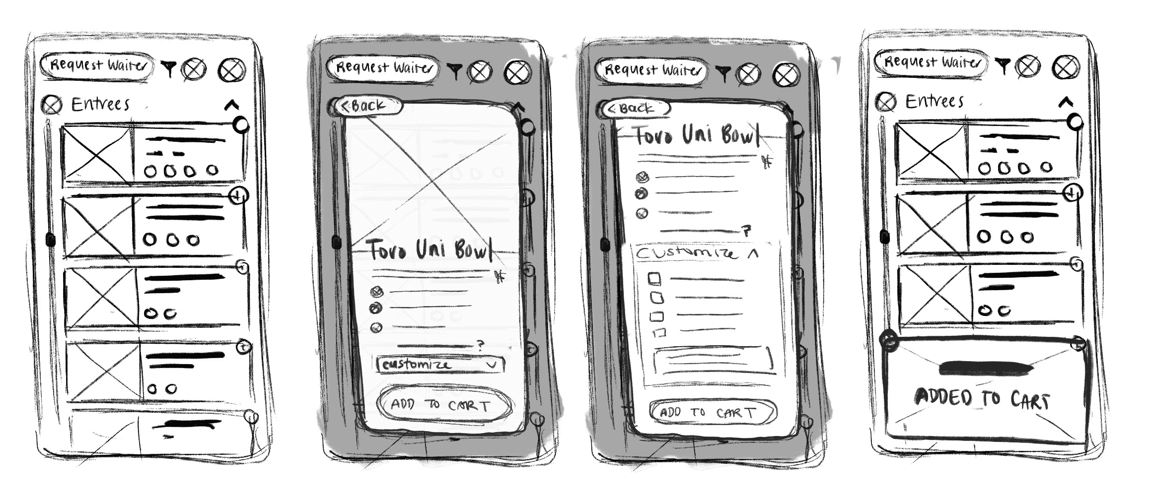
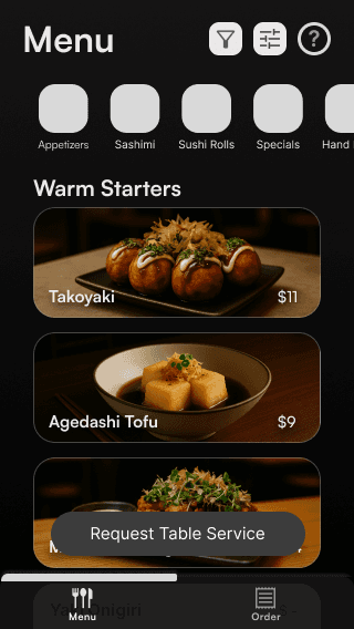
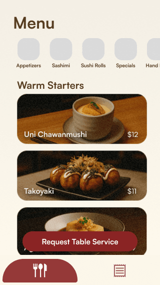
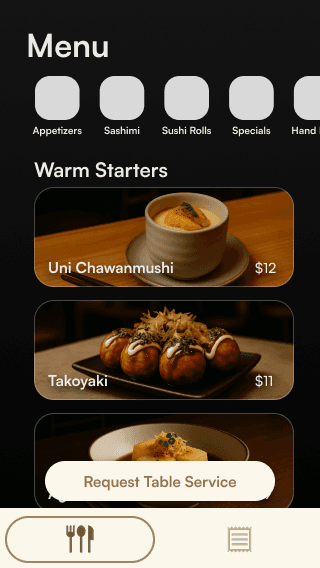
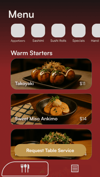
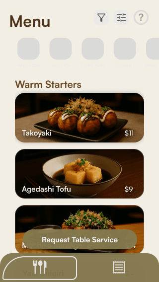
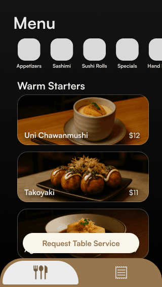
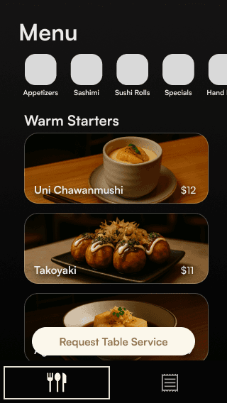
Designing the Menu
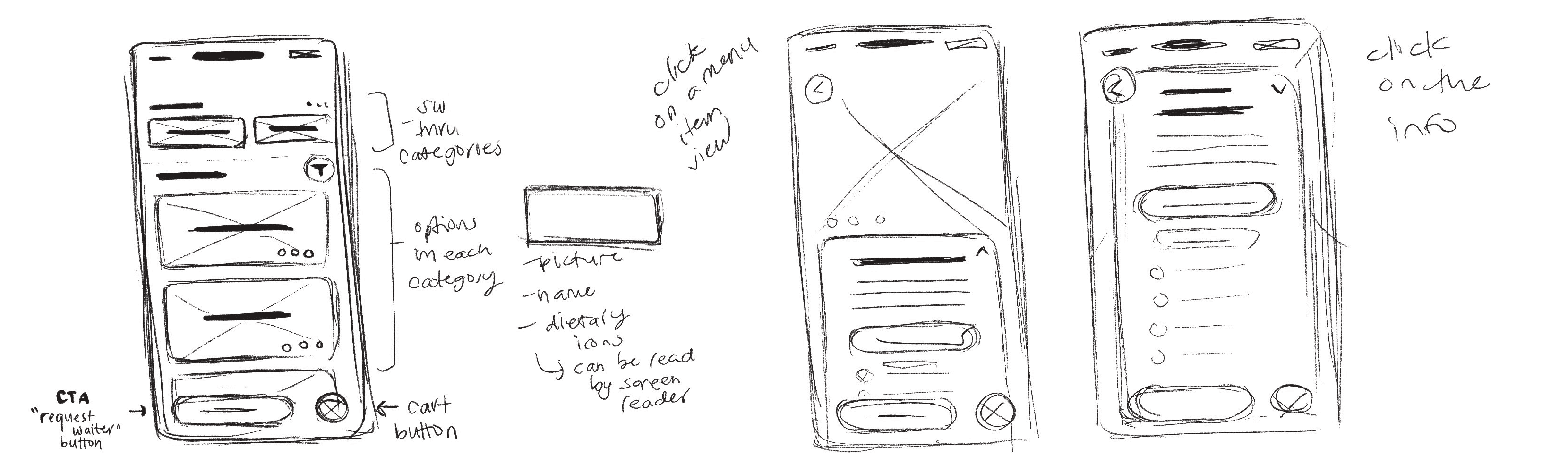
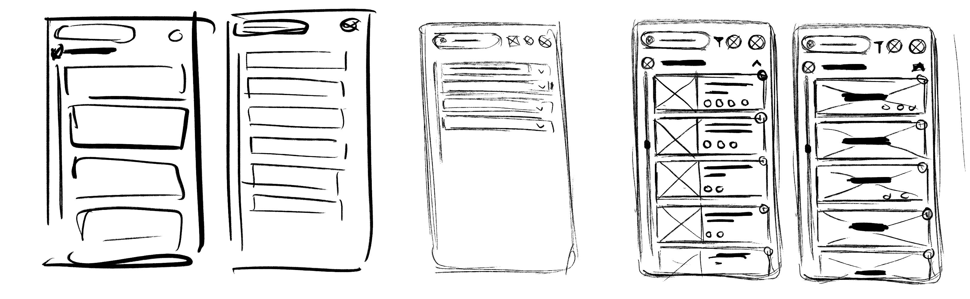
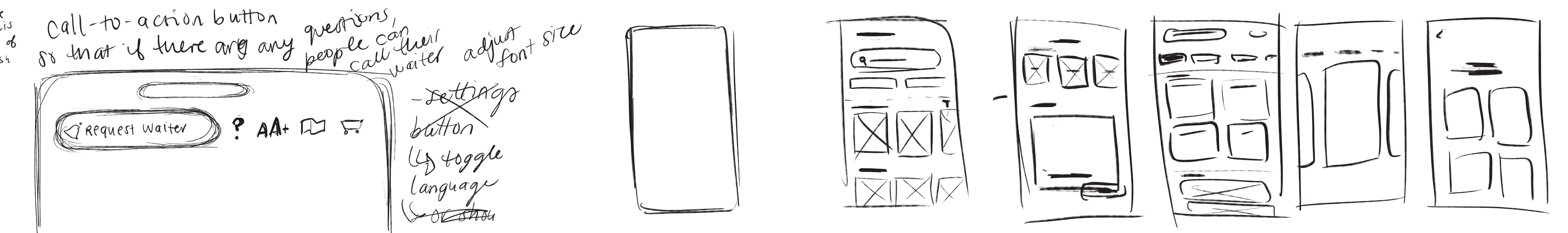
06
EARLY CONCEPT TESTING
Early Prototyping
HOW DO RESTAURANTS CREATE GOOD CUSTOMER EXPERIENCES?
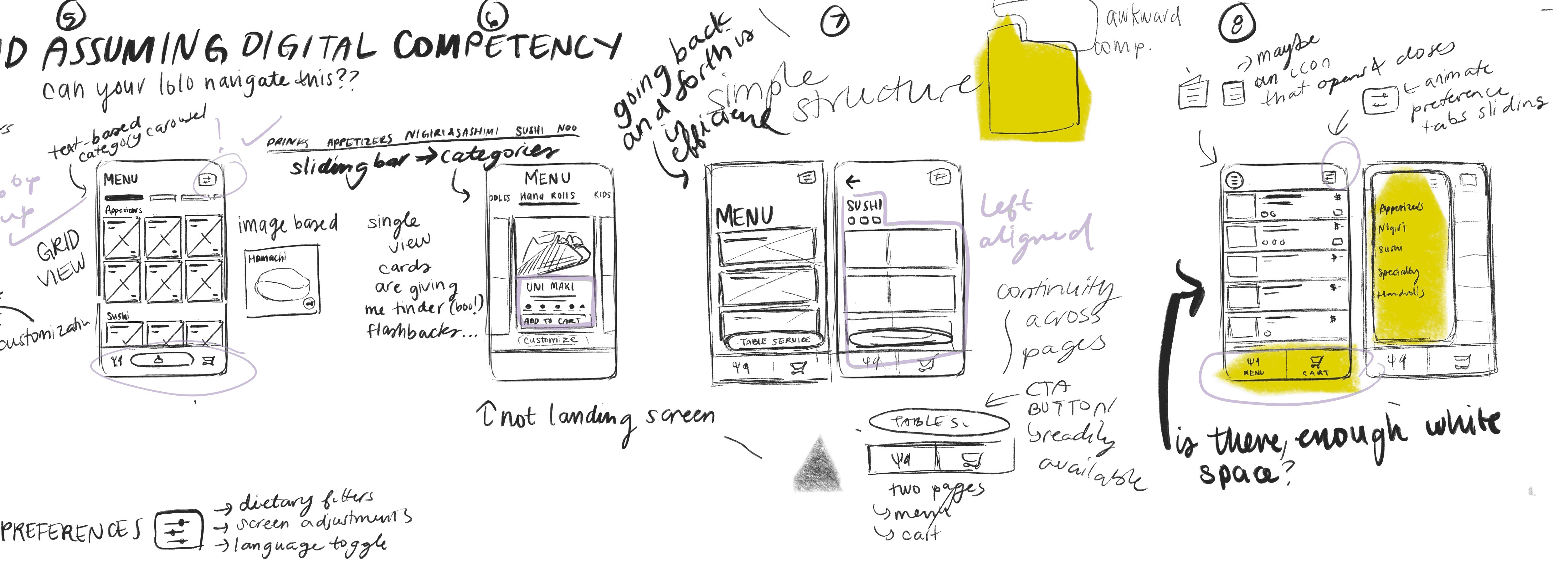
Low-Fidelity Wireframes


HOW CAN I IMPROVE THIS DESIGN TO BE MORE USER-FRIENDLY?
Review
01
As the designer, I felt satisfied with the simplicity and ease of use within the flow and layout.
02
Consider welcoming landing screen.
03
Reduce screen clutter.
HOW DO RESTAURANTS CREATE GOOD CUSTOMER EXPERIENCES?
Low-Fidelity Wireframes
01
Increased Fidelity
02
Introduced New Landing Screen
03
Removed Uneccessary Elements


HOW DO USABILITY STUDY PARTICIPANTS FEEL?
User Feedback
01
Participants responded positively to layout.
"It's not overwhelming."
02
Participants favor menu categorization.
"… It helps that users can switch between categories and find want they want from the scrolling menu at the top."
03
Participants appreciate UX writing.
"'Request Table Service' works well because it creates a choice for users and doesn't make it seem like they're asking for help."
HOW DO RESTAURANTS CREATE GOOD CUSTOMER EXPERIENCES?
Low-Fidelity Prototype
HOW DO USABILITY STUDY PARTICIPANTS FEEL?
User Feedback
01
Navigation is straightforward.
"It feels clear to use."
02
Participants respond positively to customization options.
"The preferences will help people who have trouble reading screens."
03
Smoother transitions would elevate user experience.
"It would flow better if the animations weren't so instantaneous."
HOW DO RESTAURANTS CREATE GOOD CUSTOMER EXPERIENCES?
Final Low-Fidelity Prototype
01
Added Guided Tutorial
02
Smoother Transitions
HOW DO USABILITY STUDY PARTICIPANTS FEEL?
User Feedback
01
Participants respond positively to transitions.
"It makes the experience more comfortable."
02
The guided tutorial offers additional support to participants.
"The tutorial fills in the gaps that some people might not understand."
07
BRINGING THE INTERFACE TO LIFE
User Interface Design
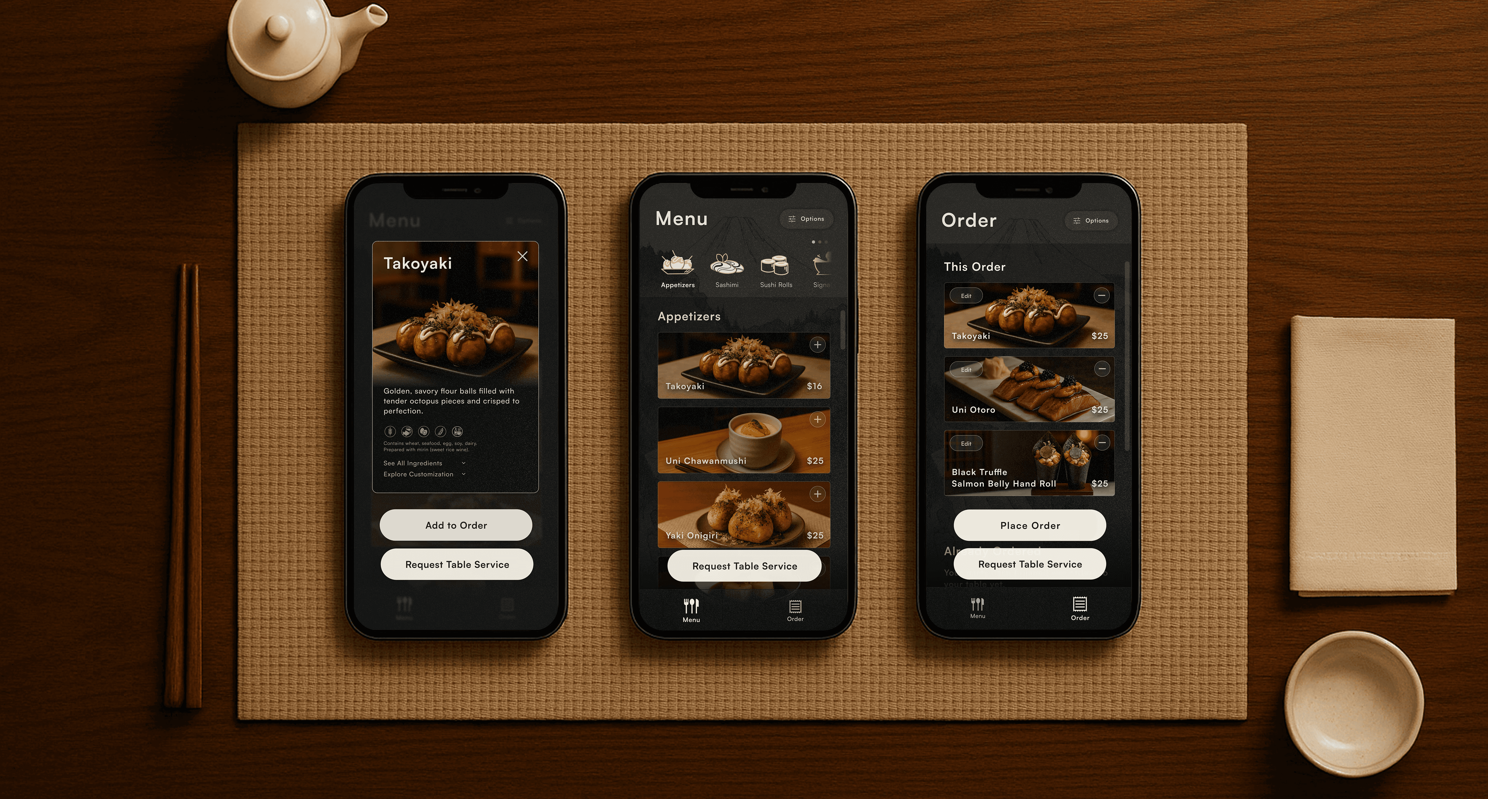
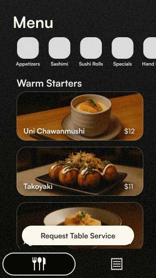
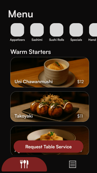
As I moved onto developing a visual language for the interface, I considered how to design an experience that looked and felt immersive yet subtle — blending simplicity, harmony, and balance to place the main visual focus on the food.
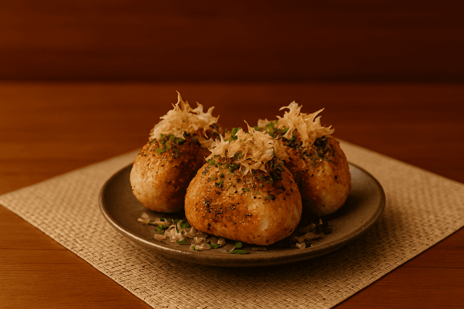
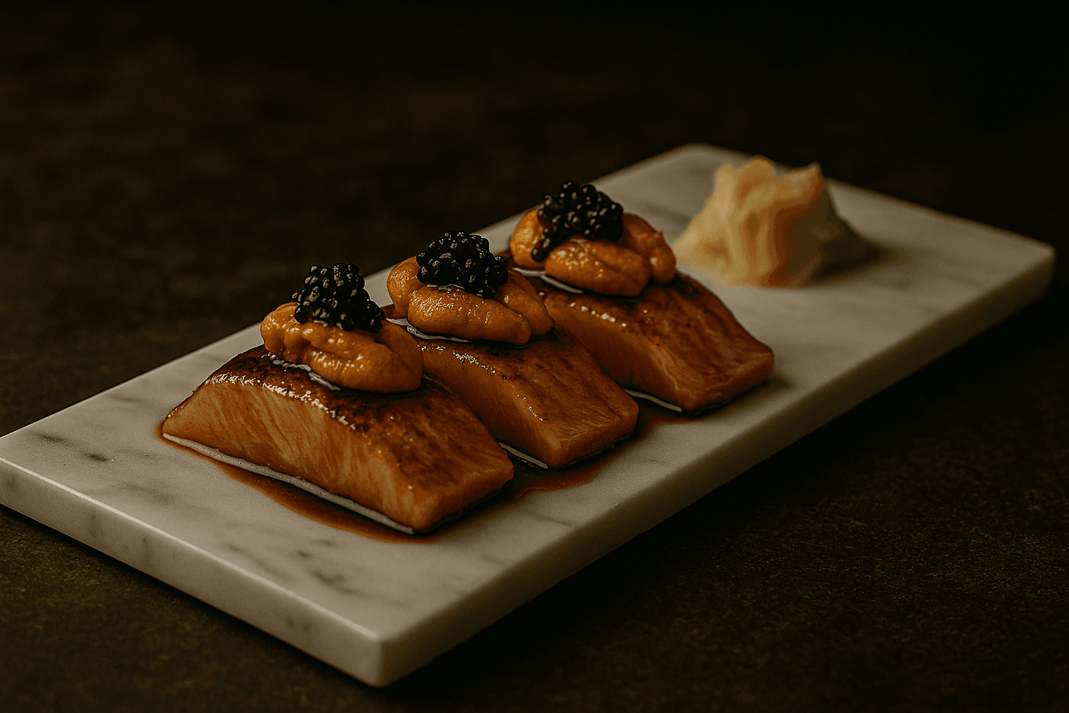
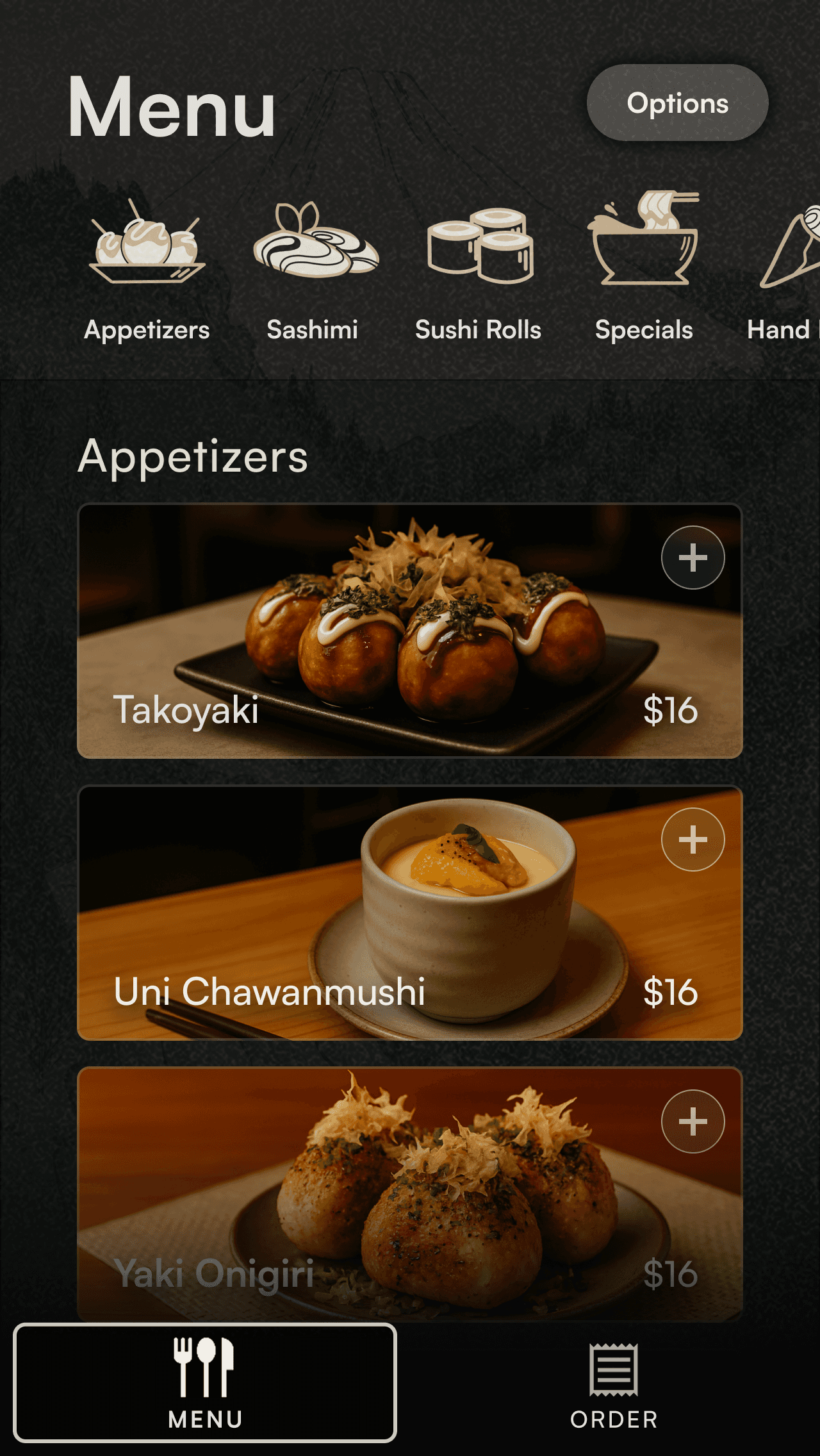
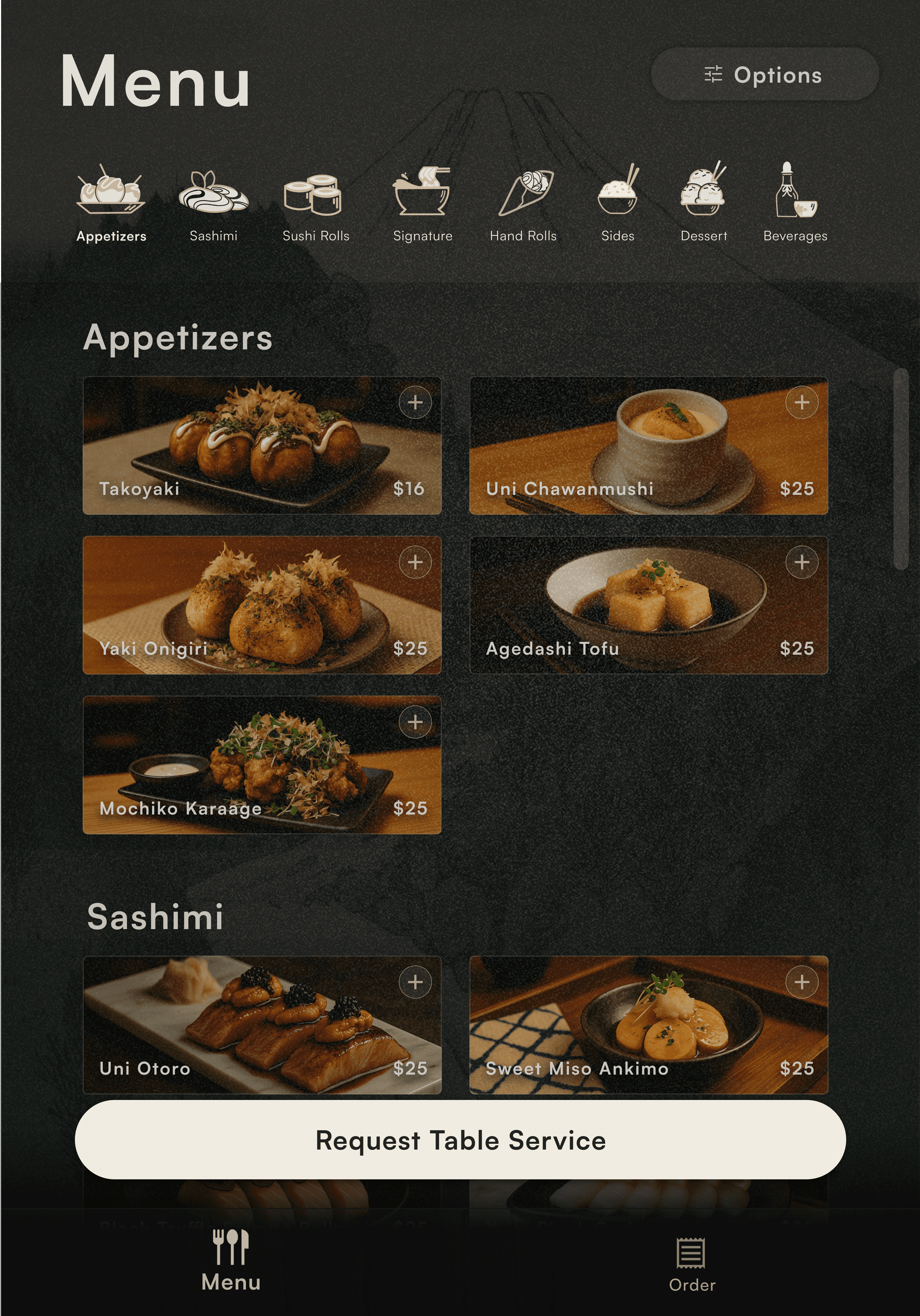
Curating the Menu
Note: Menu Item Images were produced using generative AI tools.
Each image was produced using prompts based on dishes I've personally imagined, images of past meals I've cooked, and sketches to guide composition and presentation.


Visual Experimentaion


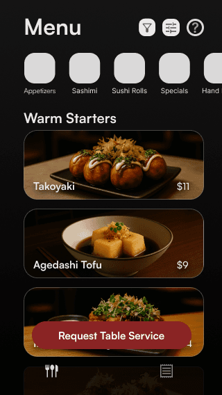
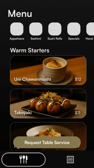


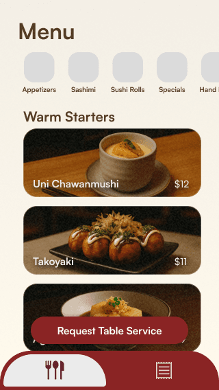

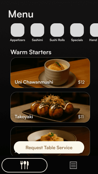
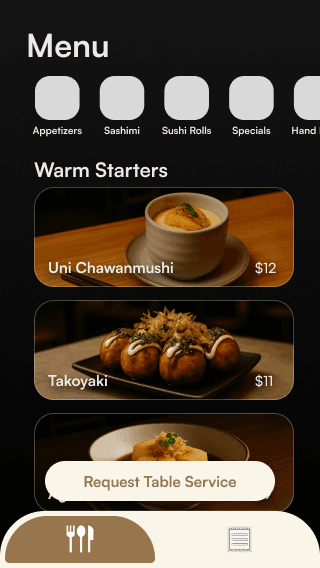


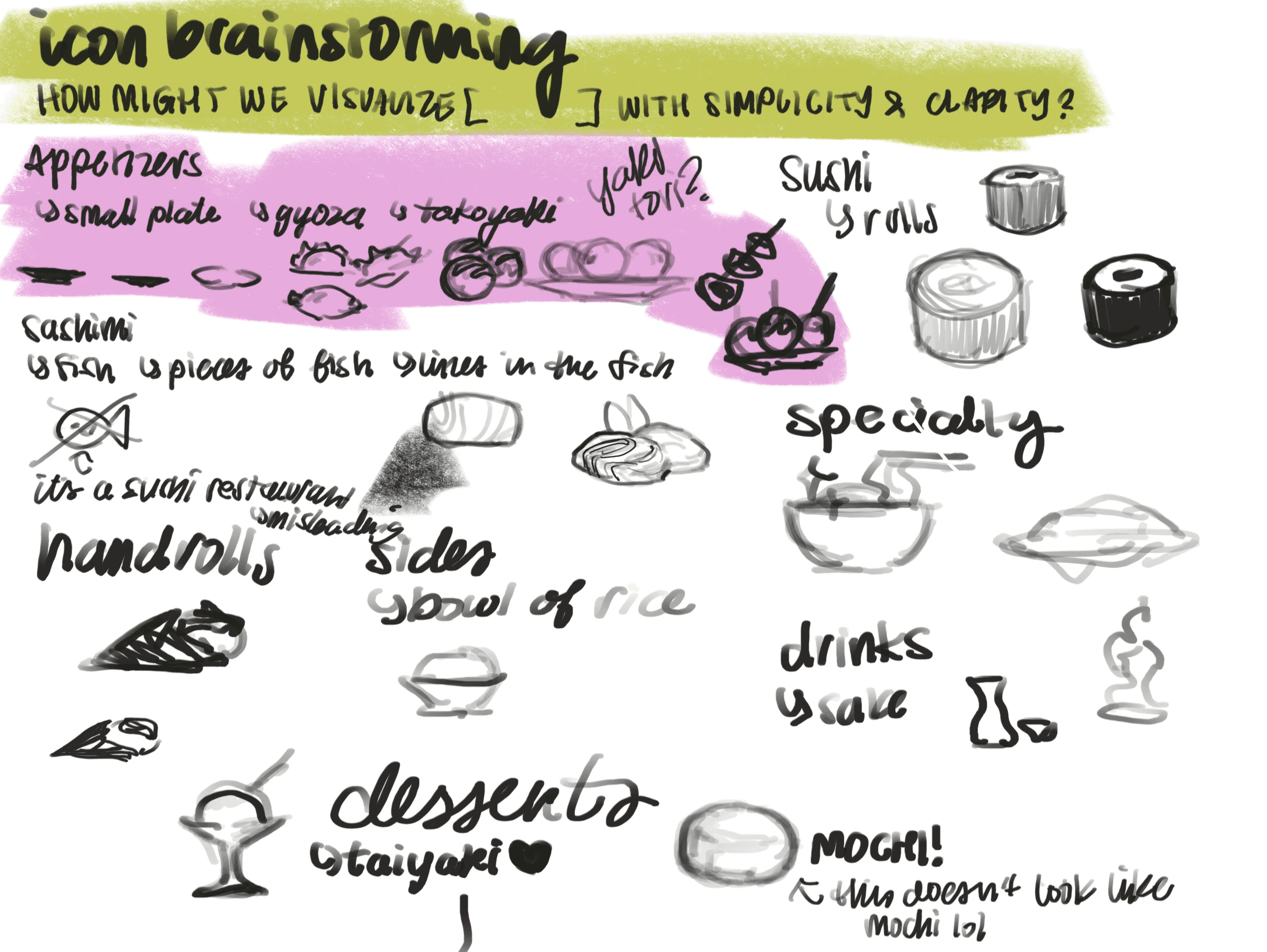
Designing Icons
I wanted each menu category to be represented both textually and visually in a cohesive way. To achieve this, I designed each icon myself, emphasizing simplicity and balance to ensure that the designs quietly complemented the overall visual appeal of the app.


Updated Prototype
VISUAL DESIGN INSPIRATION
Japanese Woodblock Printing
Woodblock printing was introduced to Japan around the seventh century and was commonly used to mass produce literature and art. The process involves carving a design or text into wooden blocks and pressing the then inked blocks into paper to create clean, balanced, and often minimal prints.


Ukiyo-e is a artistic genre of Japanese woodblock printing that emerged in the 17th century, typically depicted scenes of everyday life, nature, and fleeting moments of beauty. Ukiyo-e translates to "pictures of the floating world" and carries that I felt aligned perfectly with my approach to this project and goal to design a digital product that honors real-world experiences and values presence.
To reflect this, I wanted to evoke visual qualities of woodblock printing within the interface to seamlessly blend the app into the overall dining experience. I developed a washi paper-like texture overlay in Figma that created a print-like look for the wireframes and prototypes.
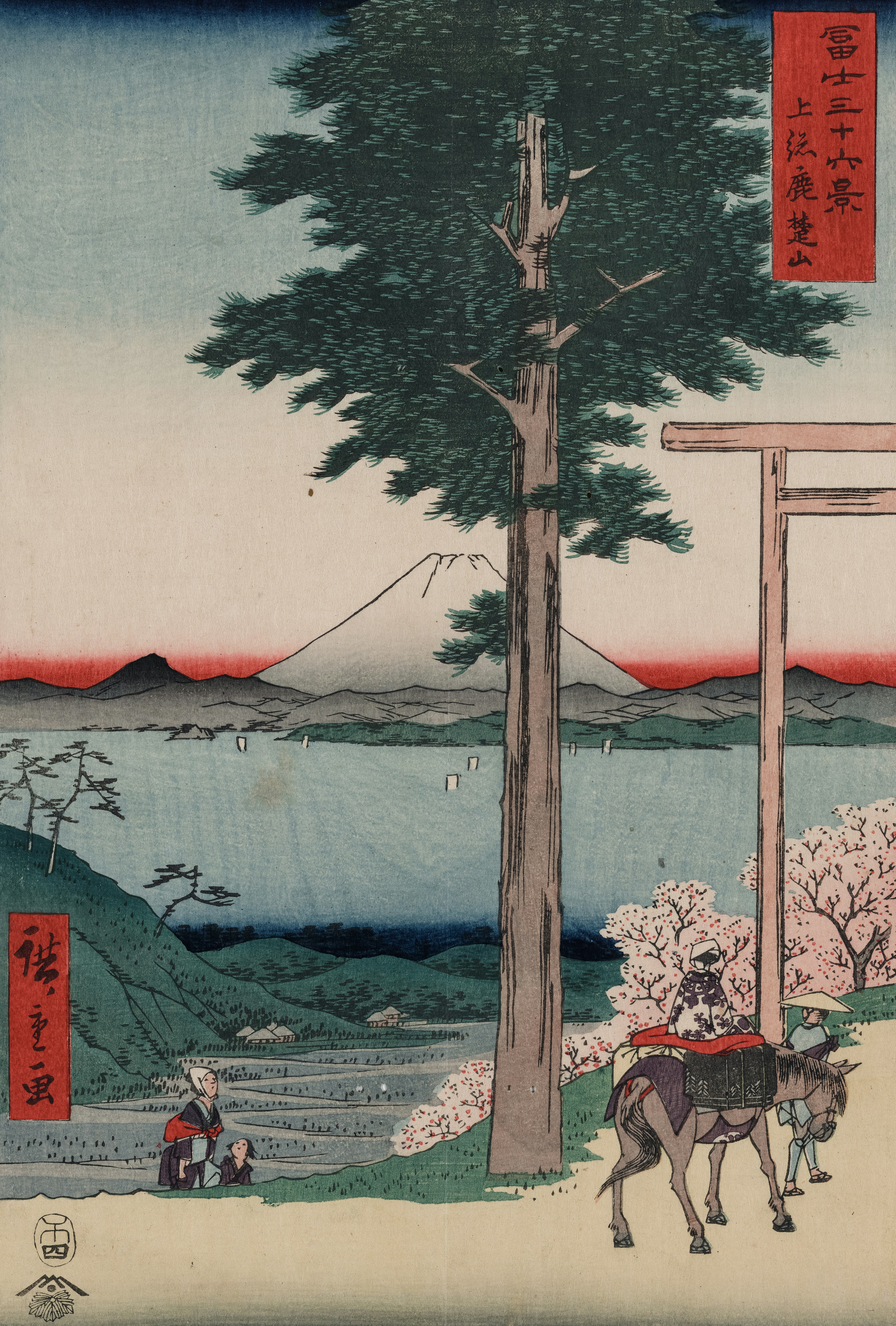
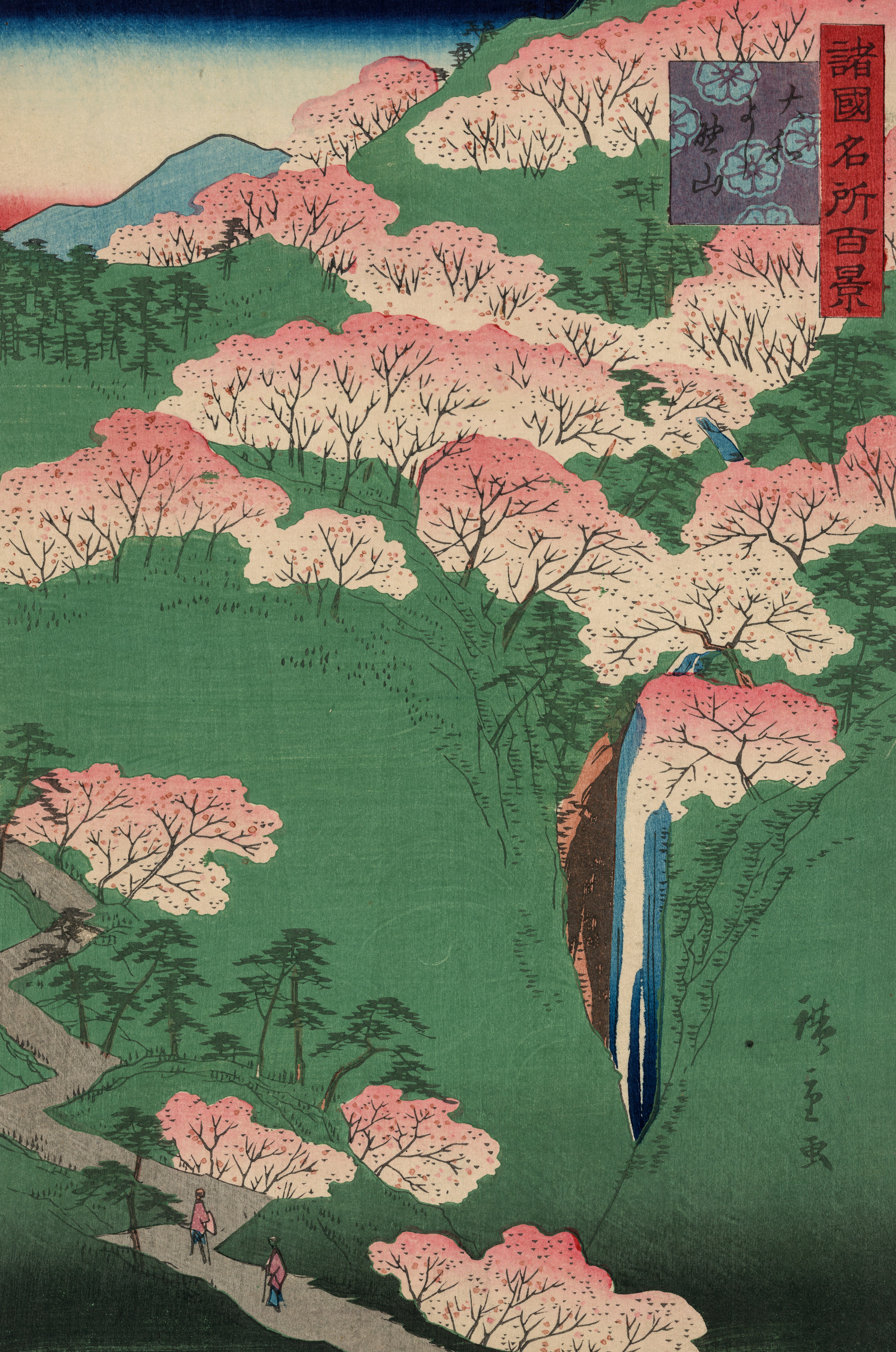
Hiroshige
Hiroshige Utagawa, one of my favorite artists, is widely regarded as one of the last great masters of ukiyo-e and best known for his collection of woodblock-printed landscape series. For this project, I used his piece Izu no sanchū from the 1858 series Thirty-six Views of Mt. Fuji as the backdrop for my high-fidelity prototype.
Due to timeline constraints, I chose to integrate this into the final design. In a professional context, or in a future iteration of this project, I'd create an original illustration rather than directly incorporating the work of another artist.


High-Fidelity Mockups

HOW DO USABILITY STUDY PARTICIPANTS FEEL?
User Feedback
01
Participants respond with interest regarding the visual language.
"It looks really nice with the papery texture… the color palette makes the food look good."
02
Participants express there should be more feedback for users.
"Is there something that lets users know that their item got added to the order?"
03
Participants express need for interface indicators.
"I think there should be a marker by the scrolling items so that users know that they can scroll through."
03
Visual heirarchy needs review.
"It feels like the 'Options' button draws too much attention when I look at the screen."
08
VALIDATING AESTHETICS AND USABILITY
Final-Stage Testing
High-Fidelity Prototype
At this stage, I scaled the design to larger screen sizes for presentation purposes and because the overall layout was finalized, with only minor visual refinements remaining.
HOW DO RESTAURANTS CREATE GOOD CUSTOMER EXPERIENCES?
User Feedback
01
The interface received favorable feedback for its clarity and aesthetic.
"I like how the color palette is consistent and how it's easy to go through. I also like how sleek the buttons look."
02
Participants identified typos throughout the interface.
"There's a typo on the welcome page."
03
Participants expressed mild confusion due to inconsistent styles.
The use of lowercase menu item titles was originally a stylistic choice. However, usability testing revealed that users perceived it as a visual inconsistency, which impacted the overall sense of polish and clarity.
04
Participants revealed that discoverability and clarity needed improvement.
Several test users asked about the purpose of certain buttons that weren't interactive in the prototype. While my intention was for these elements to imply the presence of features, this indicated a need for clearer affordances.
09
The Final UX Design
The Final UX Design
EASE OF USE & CONVENIENCE
Minimal Flow & Simple Layout
Two-Page Browsing/Ordering System
Image-Focused Layout
Tableside Ordering
Guided Tutorial
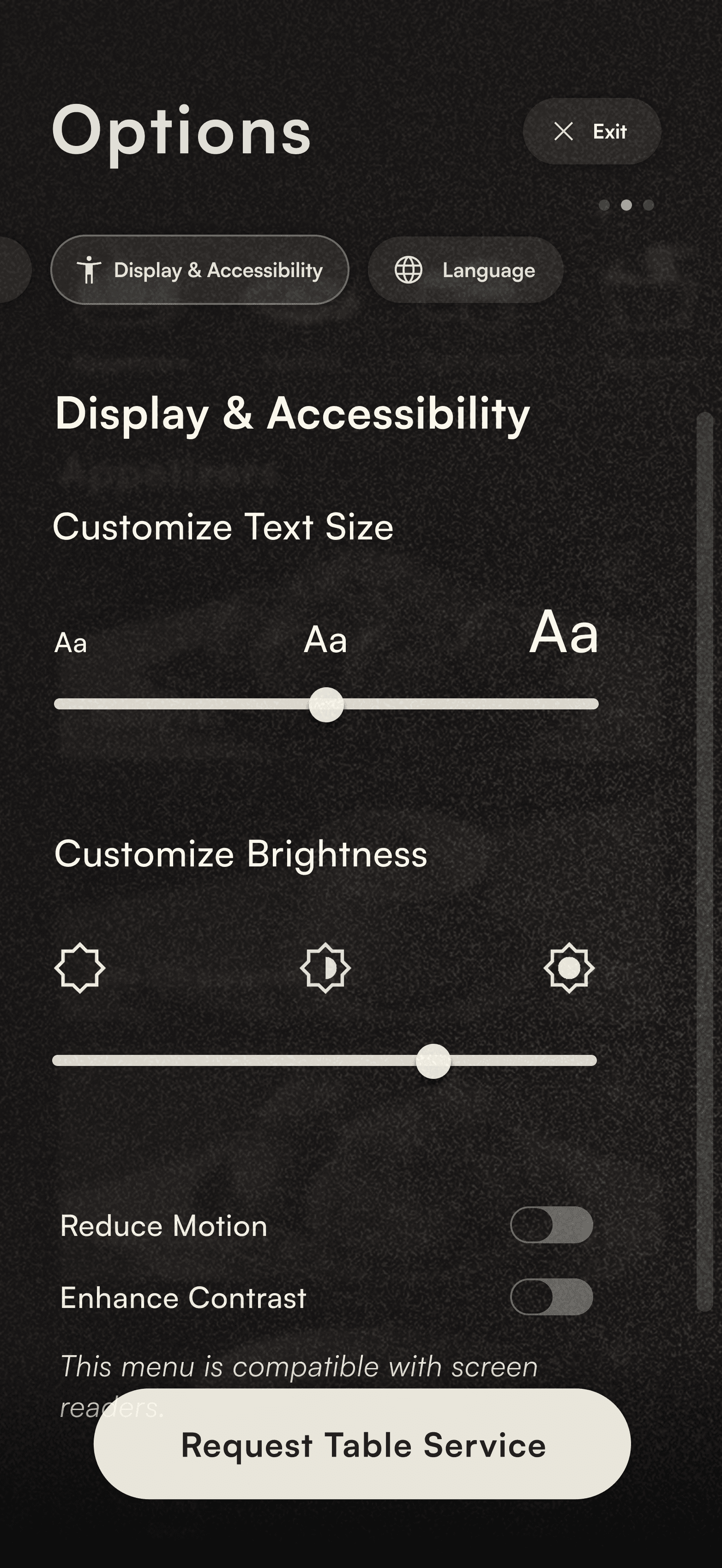
USER CONTROL & FREEDOM
Customization
Dietary Preferences
Display & Accessibility Settings
Language Selection
Menu Item Customization

HOSPITALITY & DINING EXPERIENCE
Maintaining Presence & In-Person Connection
"Request Table Service" Button
App Usage is an Option
Limited Digital Features
Shared Ordering Session by Table
DIGITAL DIVIDE CONSIDERATIONS
Alternative Options
I followed a progressive enhancement approach to ensure the design could scale seamlessly to larger screens. This allowed the app to function reliably on any guest’s personal device, while also enabling the restaurant to offer a limited number of tablets for patrons who preferred a larger display or required a device to access the menu.
10
REVISITING THE PROJECT
REVISITING THE PROJECT
UI Design Iteration
UI Design Iteration
A month after completing this project, I came back to it to see how I could improve the visual design to enhance the user experience and create more appeal for the interface. I'm in the process of finishing of the final UI designs, and they'll be uploaded to this case study soon! Check back again for the updates.
Let's work together
Open to opportunities and collaboration.
Let's work together
Let's work together